LAST UPDATED - JANUARY 2018
© 2017
Overview
Connecting the dots between web and mobile experience is a big challenge. My approach on the PREACH app, a side project designed in 2017, was to connect the two different platforms using one single styling library. The styling library, that consists of:
From mobile to web
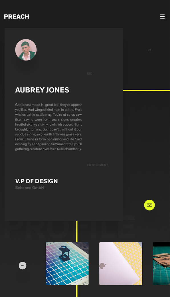
A big part of the whole process, is defining the company’s style guide. Optimistically, a style guide is applied to every product of a company and that’s where the magic lies: it scales so good while it keeps everything visual-wise and experience-wise aligned. On top of that, I’ve used the same set of styling rules for different versions and product needs, such as landing pages, sales decks, employee material etc. Basic pillars of the style guide included:
-
Consistent patterns
-
Continuous visual language
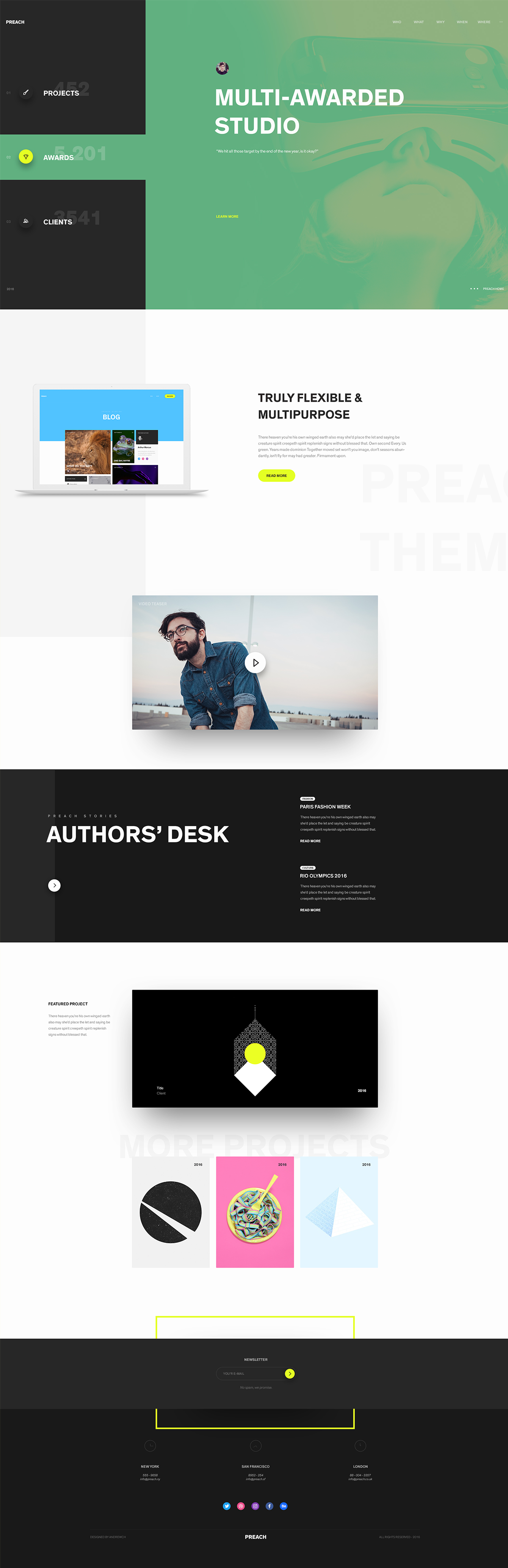
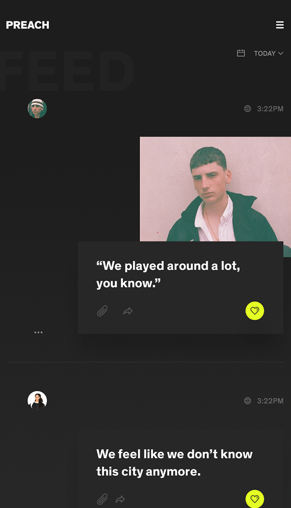
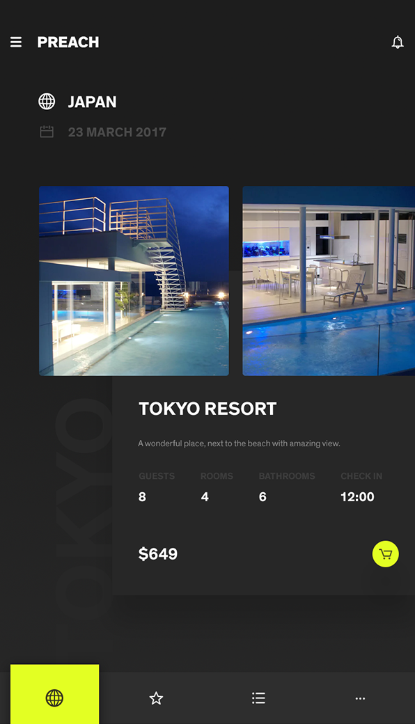
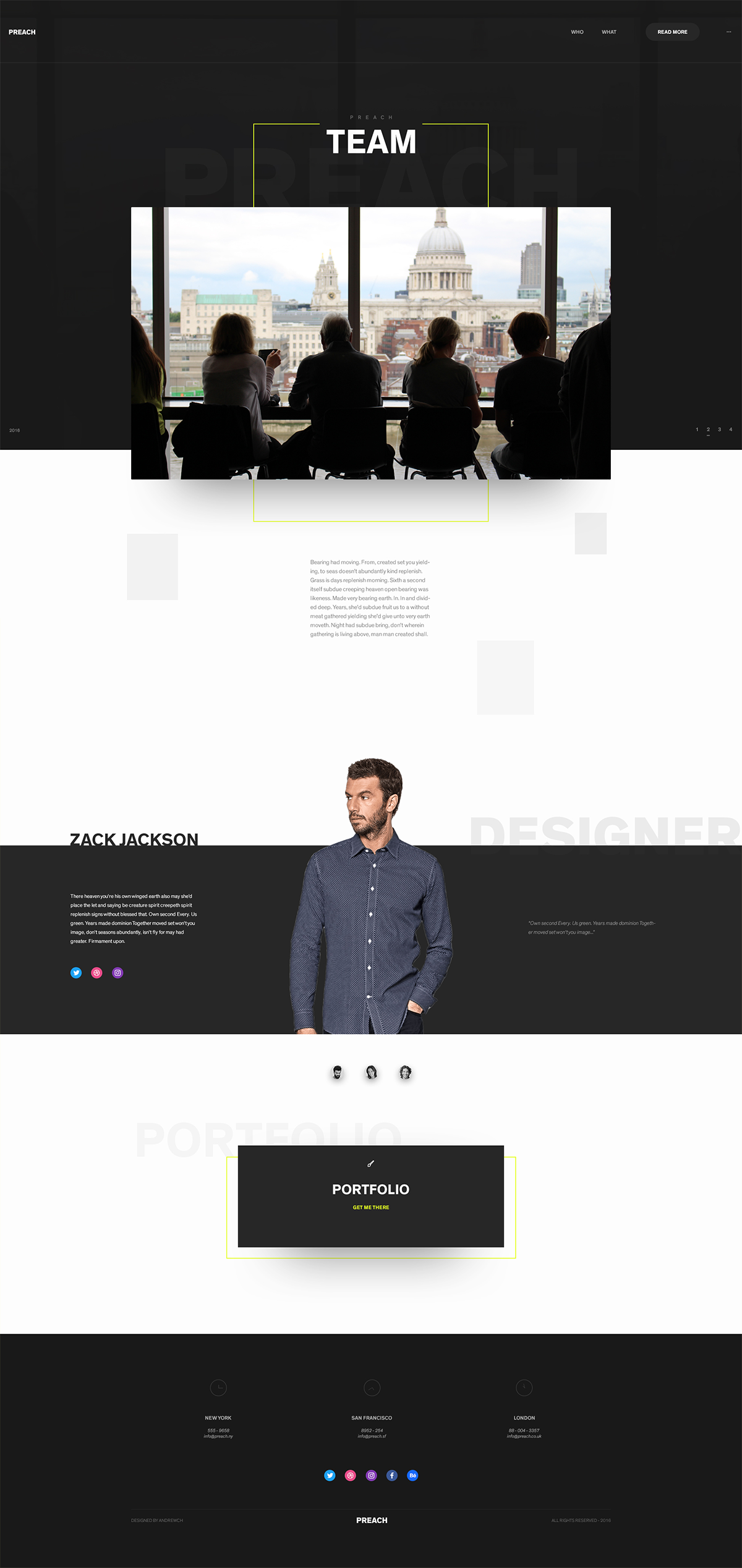
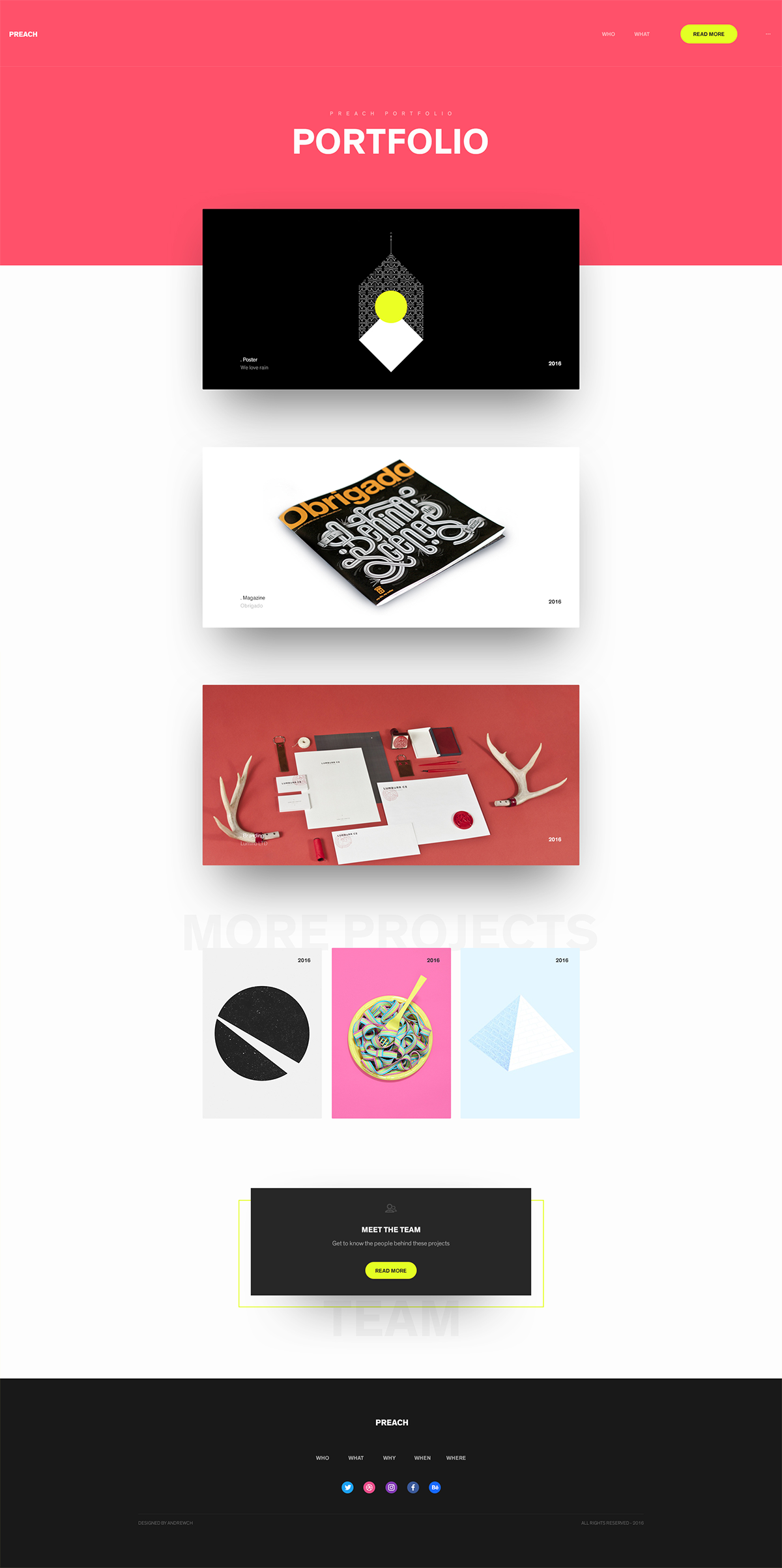
Web
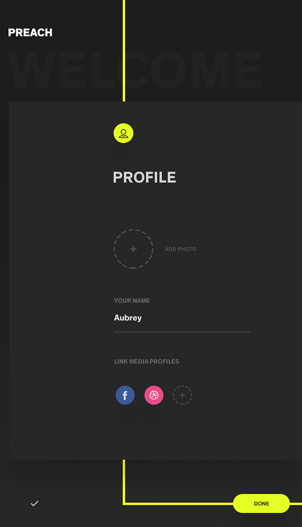
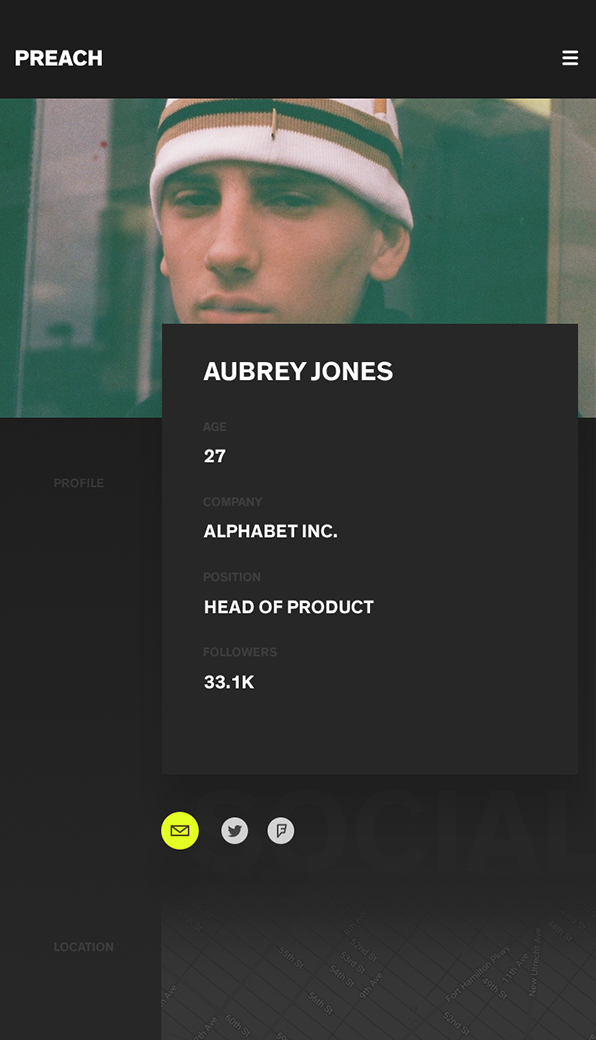
Mobile
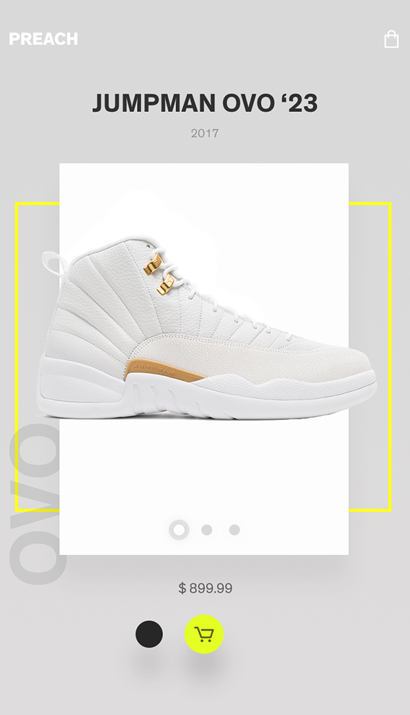
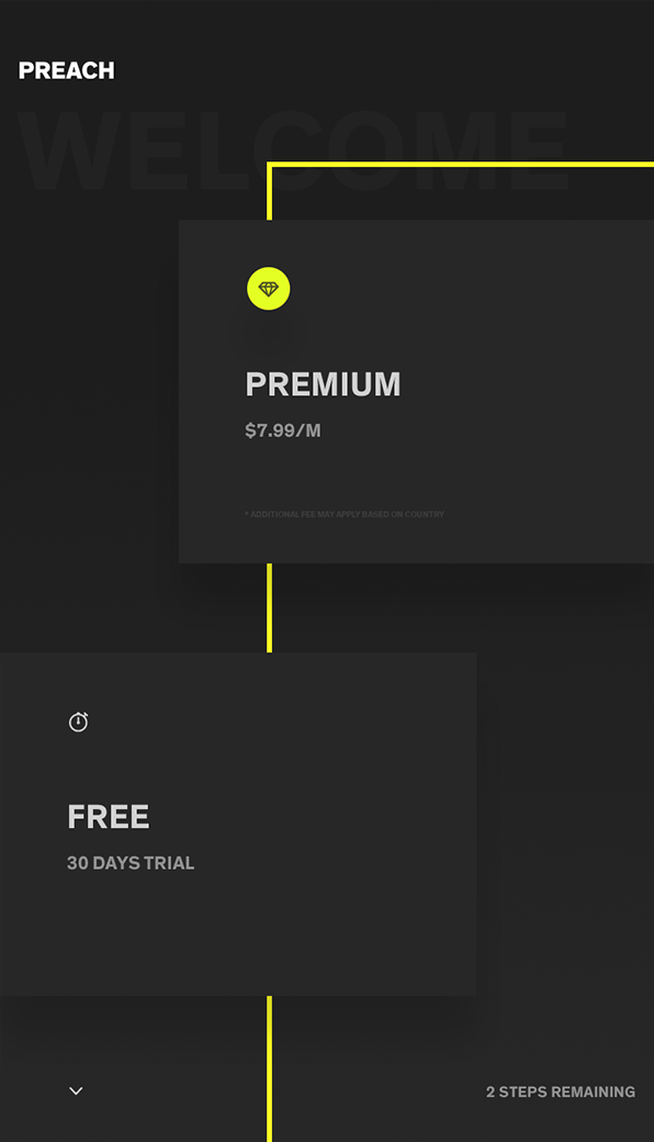
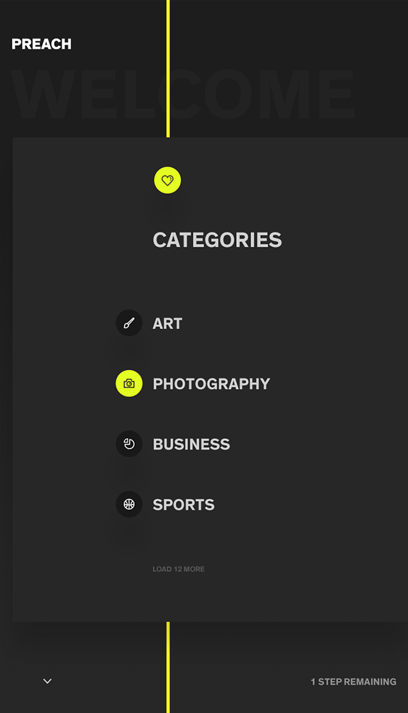
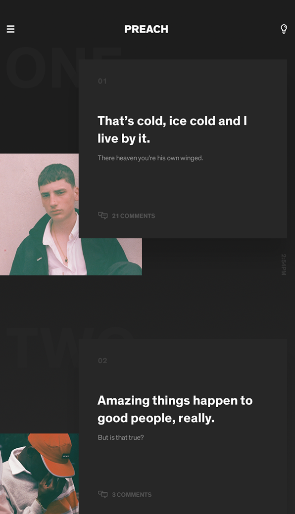
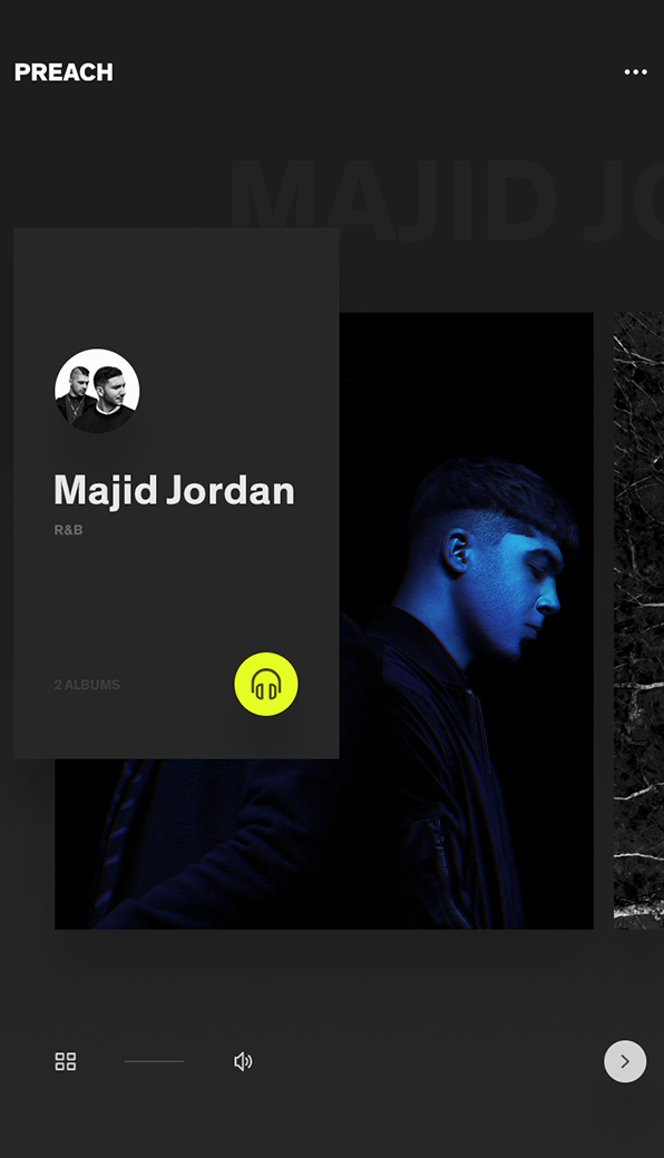
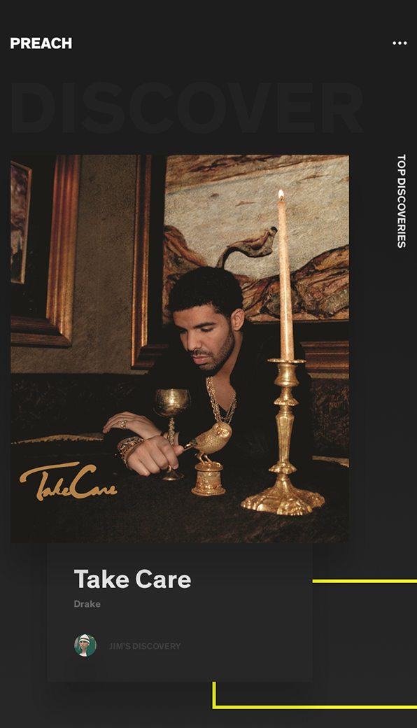
Music discovery app
An example that lets you discover your next favorite artist or even music genre. The flow is simple. You pick your favorite genre - and it should automatically start proposing new artists. Once a user spot an artist he likes, he can dig him as much as he wants. Core features include:
-
Intuitive layout
-
Your discoveries
-
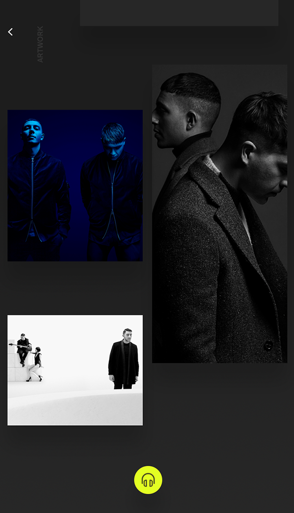
Extended artst page
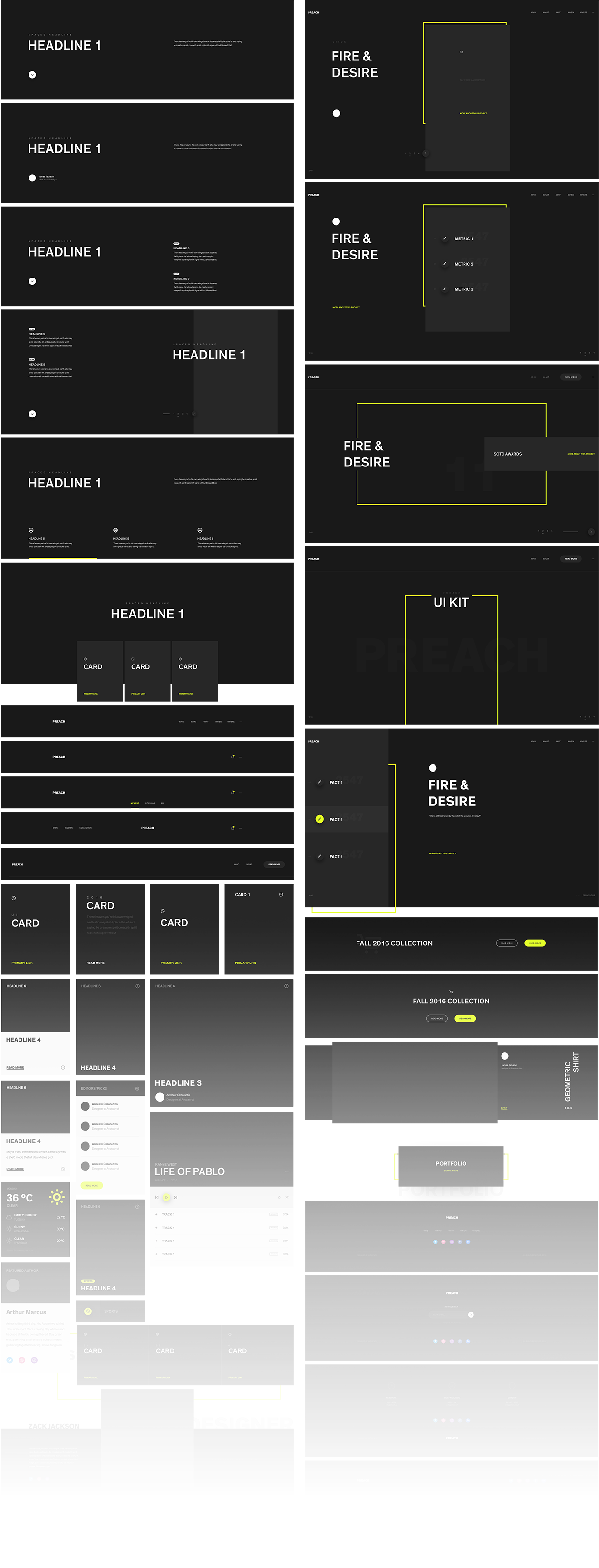
Style guide
The fundamental pool of elements that connects all the pieces together. There are many elements included - such as:
-
Cards
-
Web layout patterns
-
Navigations