LAST UPDATED - APRIL 2020
© 2018
Avocarrot Exchange Platform
The first 1/2 of Avocarrot. It's where mobile app publishers sign up, integrate and make money from ads.
Overview
Avocarrot is the leading programmatic native ad exchange for mobile publishers. It combines real-time technology and premium advertisers from around the world in one platform. That way, mobile app developers can monetize their apps easily with native ads. My role, as the product’s designer, was to establish the brand’s identity end to end; from the landing pages to dashboard.
EXPERIENCE AVOCARROT LIVE
Process
Given the big scope of the project, combined with the multiple stakeholders and engineering team involved, a robust process needed to be in place. A process that not only covers the initial releases, which were designed to roll-out in phases, but also the iterative post-releases process - to keep iterating and refining our product to meet users’ and business needs as much as possible.
-
Optimized for fast and effective iterations on the product
-
Stakeholders, product team and sales team are in the loop
Content & wireframing
The initial part, where the main focus is to gather all the relevant content and business goals of the product we are about to built. Given that the product was around before this major redesign, we inherited a lot of features that had positive feedback and received well by our users. Engineers are welcome in this stage too - as I find it extremely useful to have early technical input and everyone has visibility.
After the initial pieces of content and user experience materials are collected, the goal is to start and brainstorm by sketching ideas to wherever we can; from white-boards to papers. Losing precious time to draw wireframes directly to a screen was out of the table, since at this stage, the more ideas the better. Once I lock in to specific wireframes, I translate them to digital format to present them to stakeholders for the final approval.
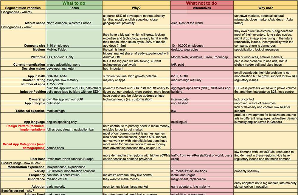
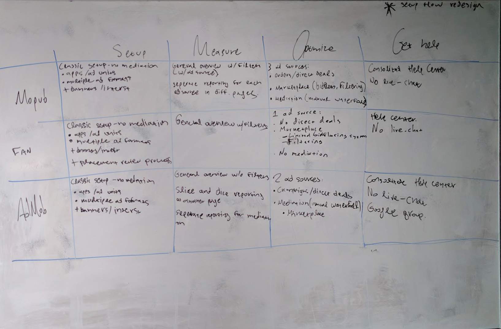
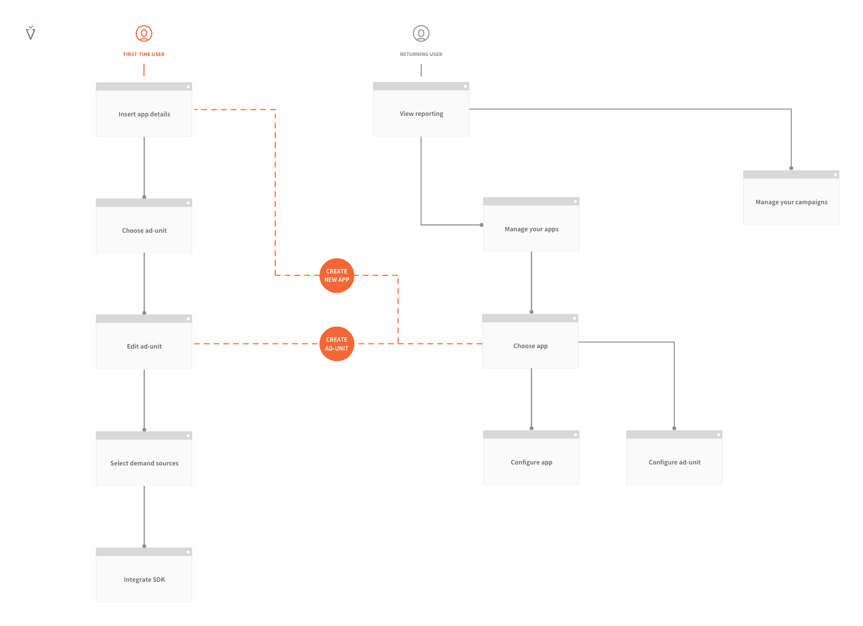
We've conducted a big user research at the start of the project. I've worked closely with Avocarrot's co-founder, and we've talked with many of our publishers about their needs and their expectations from our product. It was an amazing opportunity to interview real people - the actual users - and get direct feedback on what to build, what they like, what they don't like etc. Moreover, it was equally interesting asking the "why" behind each need. People usually come from different background, with different expertise and different goals. While we were making interviews and collecting qualitative feedback, we had an Intercom Poll inside our page too to collect quantitative. We were asking users what's the one feature they'd really love to see on our product - and we're missing it. Since we saw a repetitive pattern for needs, we decided to start categorizing them into 4 main sections: Setup, Measue, Optimize, Get help. We had a long spreadsheet with all the data in place, and we did an initial competitor analysis. We wanted to identify how is the market responding to the needs we had just collected.
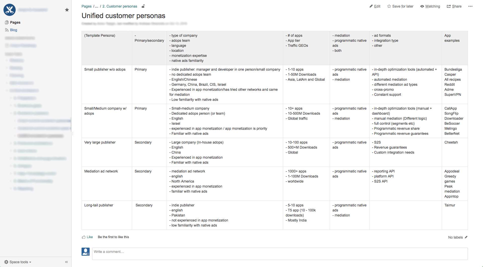
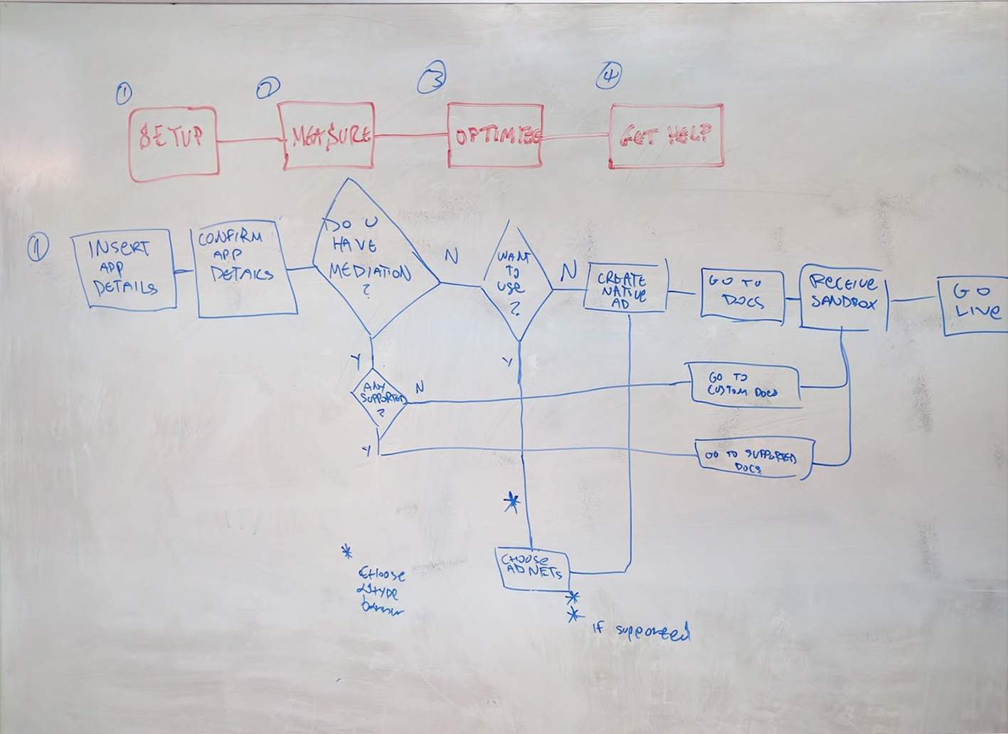
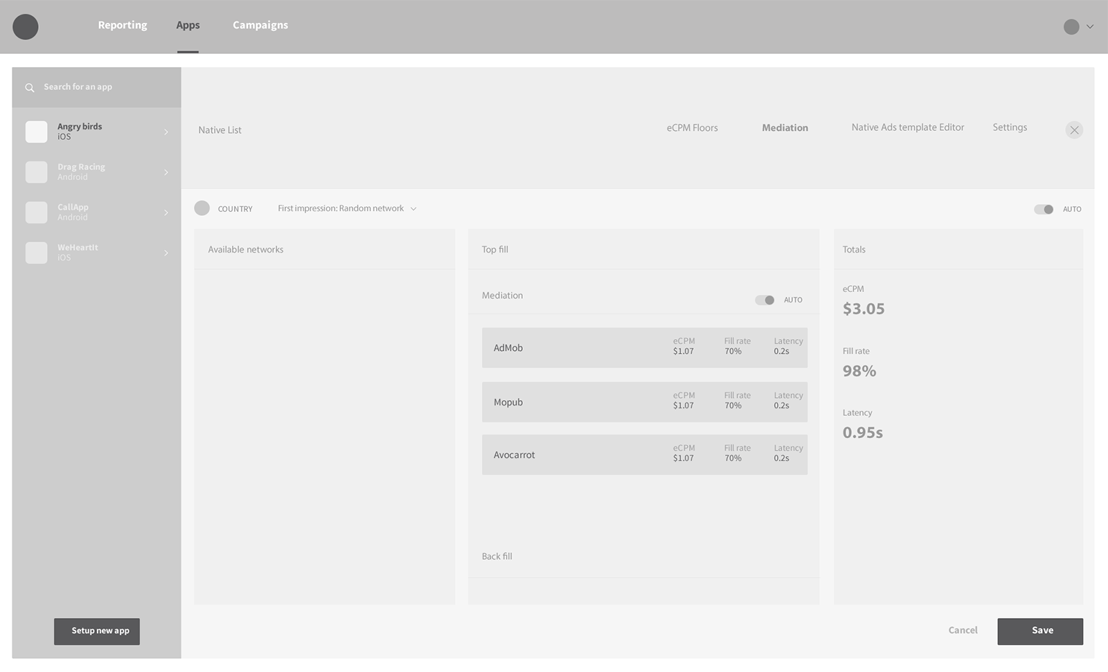
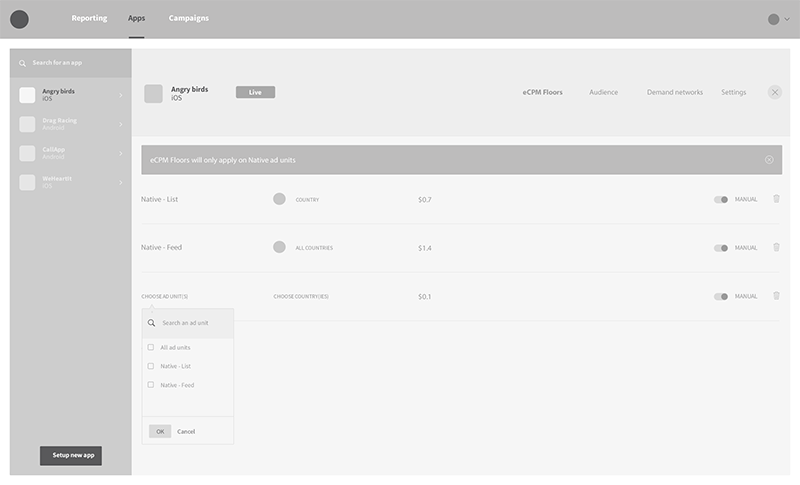
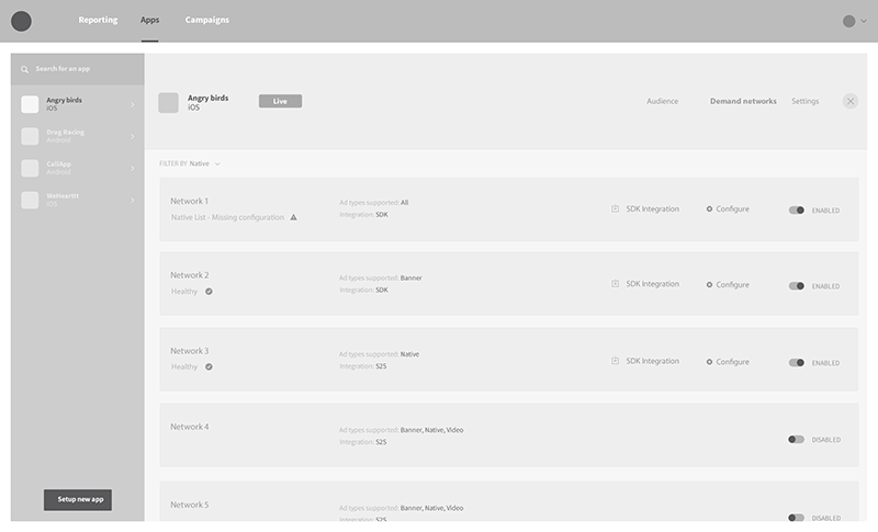
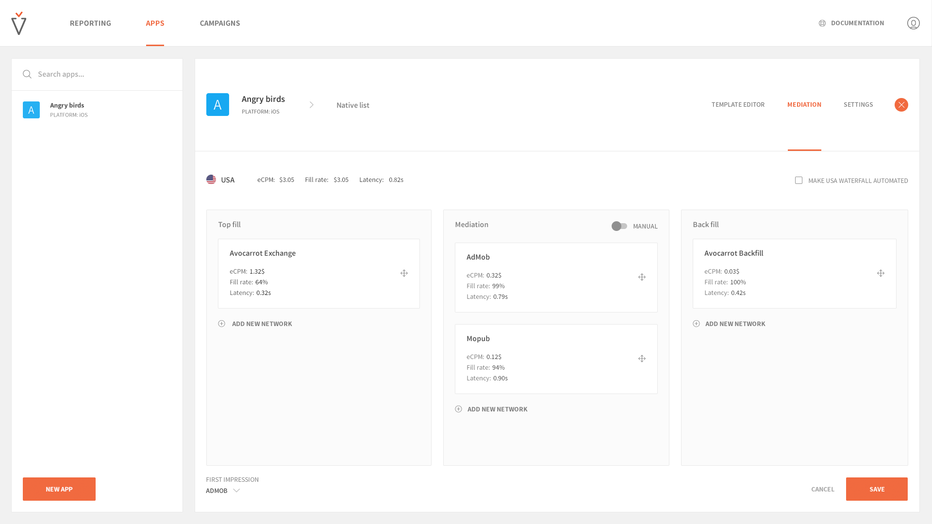
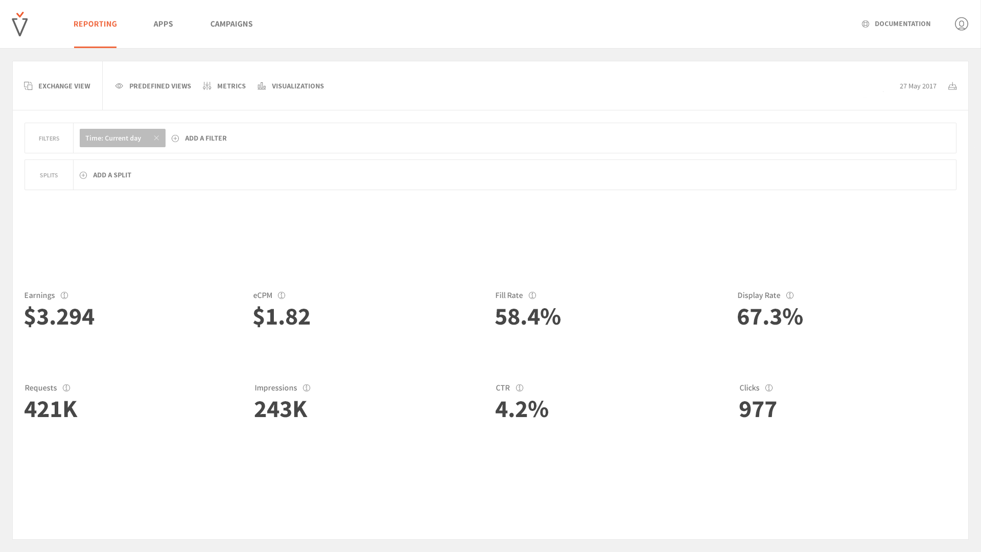
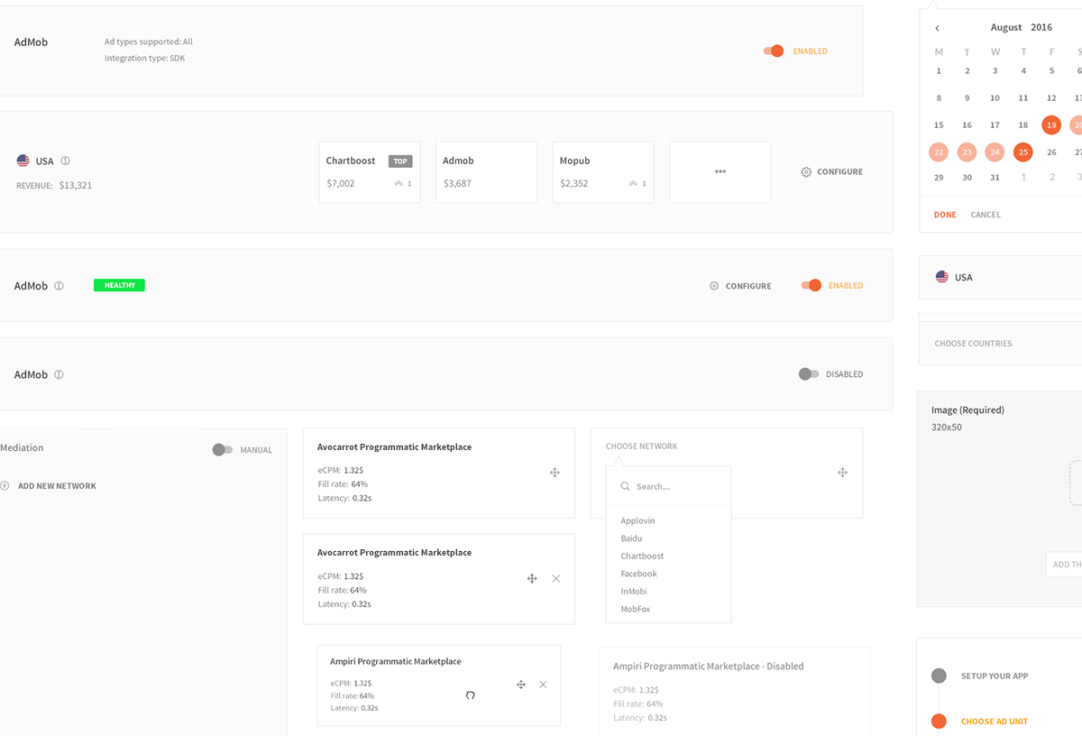
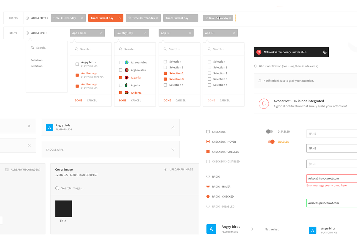
After everything fall into place, we created user personas based on the needs we had collected. We distinguished personas to primary and secondary ones. Primary ones, were our focus. They were our mission. Primary personas were publishers that we had to to satisfy with our product. Next step, was to design a user flow to satisfy primary personas. We've spent a fair amount of time testing and adjusting the flow to certain primary personas needs. The engineering team was in the loop, since we always want to have the technical perspective. For example, we wanted to offer personalized documentation whenever a publisher was integrating his app into Avocarrot. Personalized documentation, meant that sensitive data (such as IDs, Keys etc), should be prefilled for the publisher's convenience. We wanted to provide a smooth experience and only with engineers in the room we could achieve that. I've provided screenshots for certain outcomes which are the top of the iceberg. We had many iterations over and over again.

Prototypes & refinement
Translating ideas to usable products is not an easy task. The main goal here, apart from generating all possible states and pages needed, is to provide close support to the engineering team by guiding them for even the smallest detail possible. Moreover, after each release, feedback funnels such as support and analytics makes us always revisit those prototypes - the same way we did in the initial release - to iterate and try to provide the best possible solution.
VIEW PROTOTYPES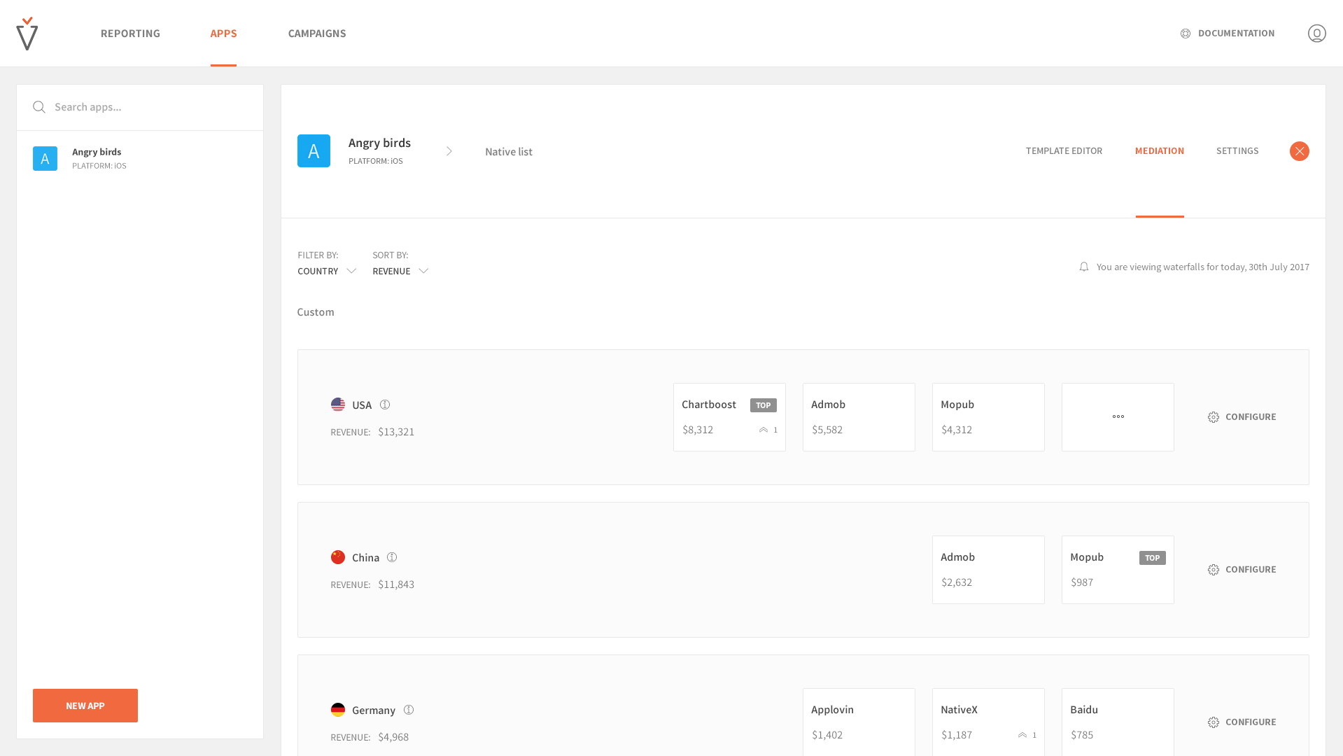
Style guide
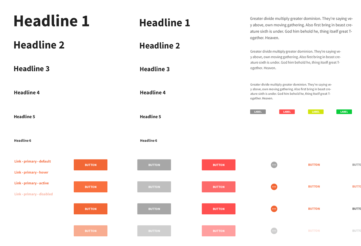
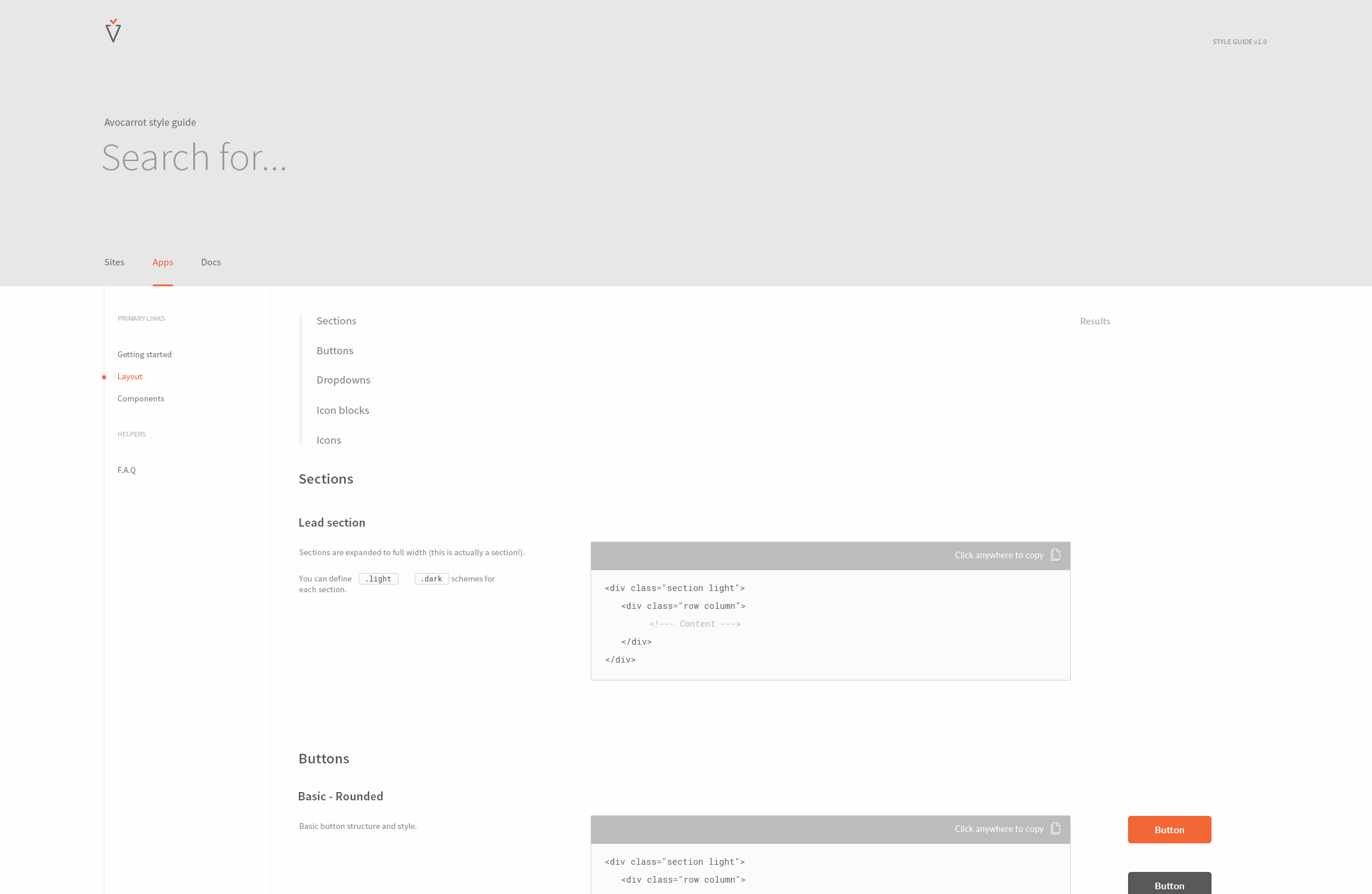
Starting off, the first challenge that I had to face was ensuring that the brand identity was correctly being applied in the product when different engineers involved in the process. As there were not definitive rules on how to implement a prototype in code, I would observe simlar designs being developed by different people with different approaches, resulting in major and brand-breaking inconsistencies. After looking into the developer needs and workflows I proposed the creation of a style guide to determine how visual elements are categorised, what states exist and what their relationships between each other is - ensuring that all people involved would comply to a standard way for translating prototypes into code.
Optimistically, a style guide is applied to every product of a company and that’s where the magic lies: it scales so good while it keeps everything visual-wise and experience-wise aligned. For instance, we saw the true potential of Avocarrot style guide since we've applied it on multiple products. On top of that, I’ve used the same set of styling rules for different versions and product needs, such as landing pages, sales decks, employee material etc. Basic pillars of the style guide included:
-
Layout
-
Color palette
-
Typography
-
Grid
-
Components
-
Imagery
-
Illustrations
-
Glossary
You can view everything live, translated in code.
EXPERIENCE AVOCARROT STYLE GUIDE LIVE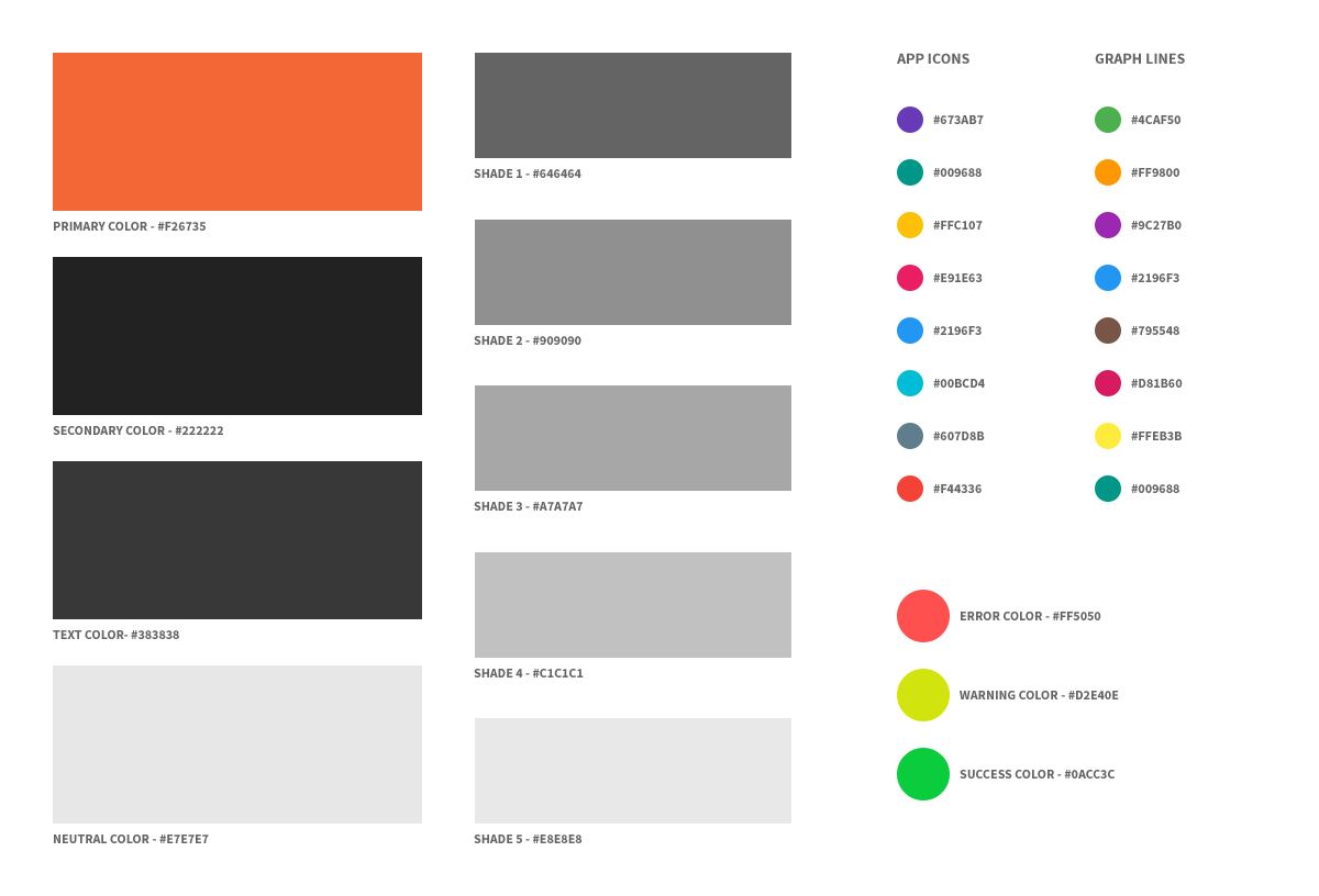
Converting all the elements and components from Sketch to actual code is an essential task. The key part here as a designer, was to participate and listen carefully how the engineering team feels most comfortable splitting the style guide to sections and entities.
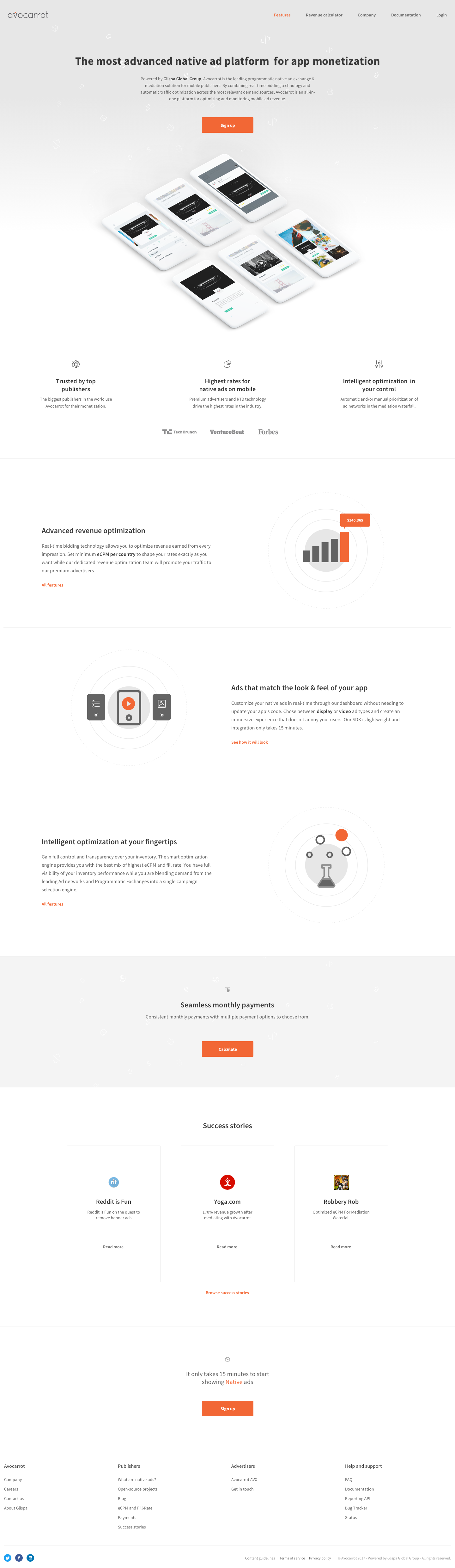
Landing page
Making a seamless experience out of all touchpoints a user interacts with your product is crucial. Landing pages are not different, since they shape a potential user’s - or business partner’s first impression about your product. In addittion, landing pages in products provide credibility about the product itself which is crucial. With all these in mind, we ended up with a sitemap enough to show all the important Avocarrot features without overwhelming the user. The process here is the same, from content to prototypes and refining - including as early as possible all stakeholders and product team. Last but not least, the sales team has great input on the landing pages, since they hold all the communication with users and they can communicate what users want to see there.
-
CSS Generated 3D phones
-
Engaging composition
-
Actionable CTAs
-
Showcasing the product
-
Revenue calculator
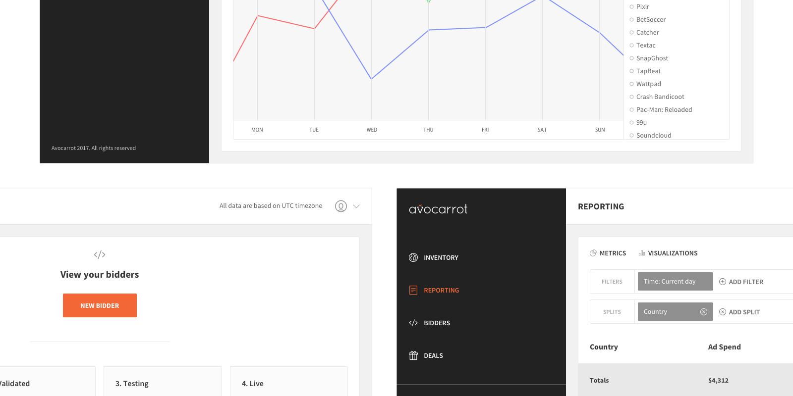
Metrics
In order to make sure we would eventually solve the need we were trying to solve, and it would make sense, we established some metrics:
-
1. The average time a publisher needs in order to integrate his app with Avocarrot Exchange
-
2. The dropoffs in our two primary funnels, the app-creation and the app-setup
-
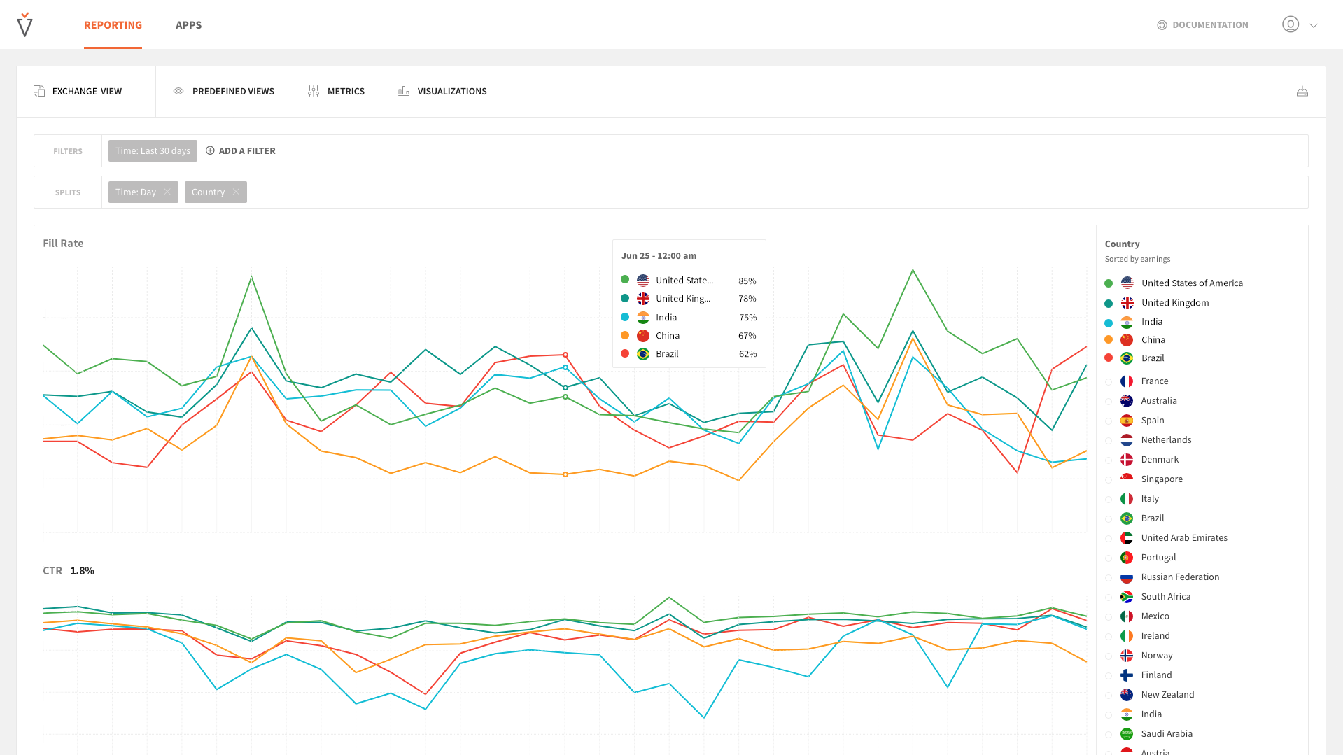
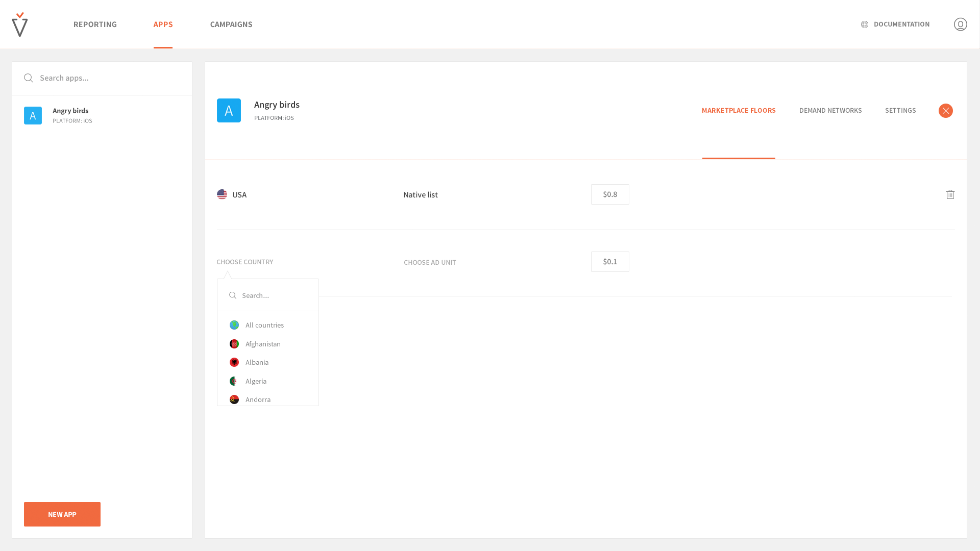
3. The feature adoption for selected features, e.g slice & dice reporting / eCPM Floors
Shipping
We wanted to avoid a 'big bang release'. A big bang release for products is when you release everything in one day. Instead, we preferred to release everything in phases. We agreed on 5 phases and on which items, feature and functionality each phase will include. Dealing with phase releases is common for products, so as a designer I was ready to make some compromises. When I say compromises, I don't mean critical ones. But in this context, I've wrote a piece on how to deal with phase releasing as a product designer.
Impact
Essentially the mission we had for the Avocarrot exchange, was a company wide mission: Be the #1 stop solution for mobile app publishers. The impact this project had, was multi-dimensional. For publishers, it was more convenient than ever to integrate Avocarrot inside their app and start making money. But it doesn't stop there; they'd been generating revenue with Native Ads. Native Ads is the way to go as a publisher, if you want to blend ads to the look and feel of your app. In other words, make the advertising experience pleasant and not intrusive. Moreover, as a company-wide impact was the global growth that got doubled up since the release of this re-freshed and re-designed Avocarrot Exchange Platform.
Avocarrot Demand Platform
The Demand Platform is the 1/2 of Avocarrot. It's where advertisers sign in, integrate and view reports for the traffic they buying from Avocarrot Exchange. We've build a product that answers the questions: what and how am I buying?
VIEW PROJECT